Hyatt Hotels Navigation
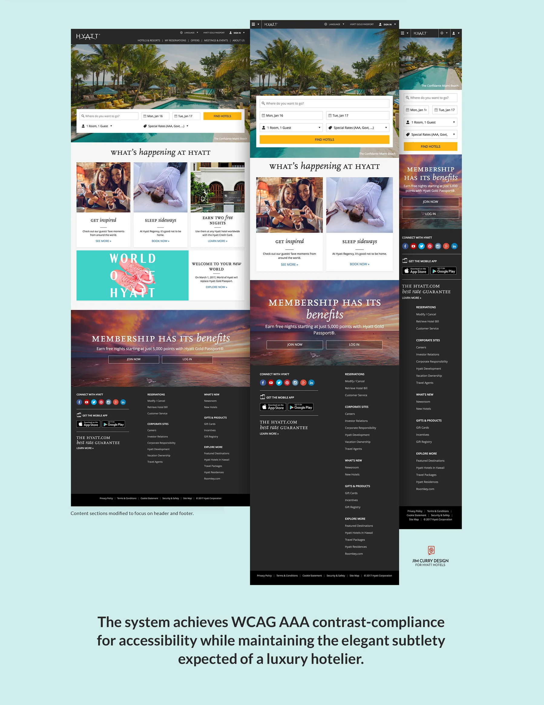
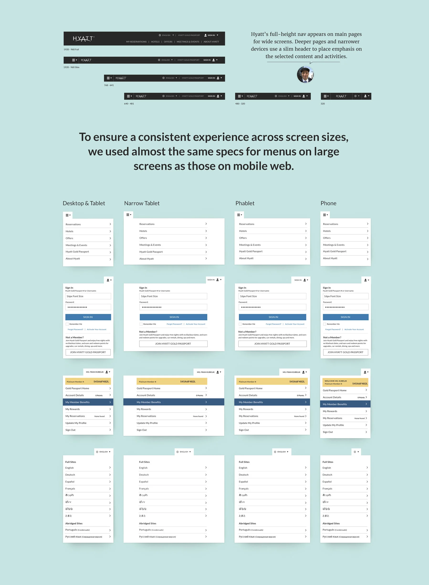
Hyatt needed a responsive retrofit of its legacy navigation. We used the opportunity to:
- Edit away superfluous menu and footer items.
- Increase element sizing for touch.
- Increase text sizing and font choice for better legibility/readability.
- Add sophistication and separation of the header and footer from the content by introducing the use of sub-brand-agnostic carbon grey.
- Adapt Hyatt Hotels's legacy master brand to more digital-appropriate style.
Try it out: Hyatt.com


